Released by Apple on September 22, 2023, the iPhone 15 Pro Max operates on the iOS operating system. To evaluate cross-browser compatibility and responsive design specifically tailored for the iPhone 15 Pro Max size, consider using the Blisk app. This phone is designed for standalone use or simultaneous operation with various other popular devices.
Explore the capabilities of the iPhone 15 Pro Max, with a particular focus on its size, using the Blisk app for comprehensive testing.
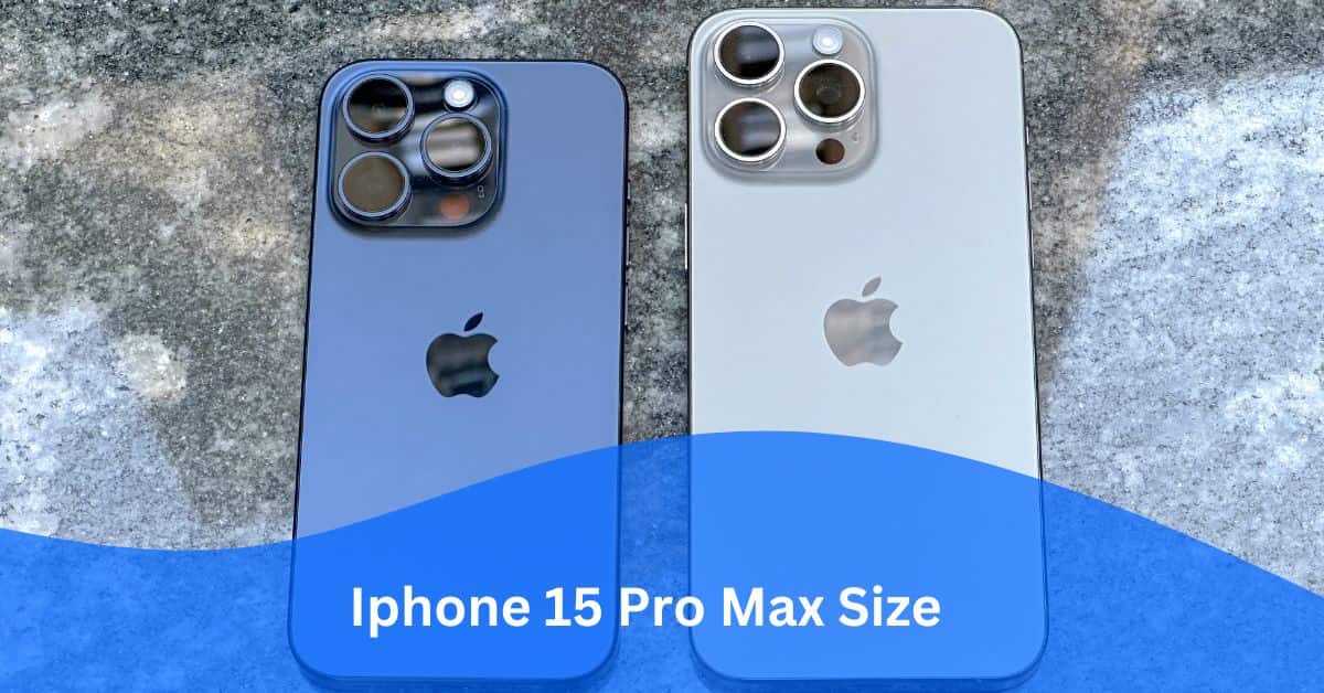
Overview and Dimensions:
Contents
Apple introduced the iPhone 15 Pro Max on September 22, 2023, featuring the iOS operating system. Out of the box, the device comes equipped with the Safari web browser for iOS.
The iPhone 15 Pro Max size is characterized by dimensions of 76.7 × 159.9 × 8.3 millimeters (3.02 × 6.3 × 0.33 inches) and a weight of 221 grams.
This device boasts a spacious LTPO Super Retina XDR OLED display, measuring 6.7 inches (110.2 cm2) with a 19.5:9 aspect ratio, providing an approximately 89.8% screen-to-body ratio. The touchscreen display supports various touch events, enabling interactions through finger or stylus input.
Note: Dimensions are presented as width × height × thickness.
Screen size, Viewport, CSS Pixel Ratio:
The iPhone 15 Pro Max showcases a 6.7-inch screen with a resolution of 1290px × 2796px, featuring a viewport size of 430px × 932px.
This device maintains a CSS Pixel Ratio of 3, denoting the ratio between physical pixels (screen size or resolution) and CSS pixels (viewport).
The term “iPhone 15 Pro Max size” encompasses various aspects:
- Screen size (resolution) refers to the physical pixels present on the screen, measured at 1290px × 2796px.
- Viewport size, or the number of software pixels (CSS pixels) on the screen, is specified as 430px × 932px.
- Device Pixel Ratio (DPR) highlights the ratio between physical pixels and CSS pixels, emphasizing the impact on pixel density.
In summary, the relationship is expressed through the formulas:
- Screen Size (Resolution) = Viewport size × Device Pixel Ratio.
- Viewport size = Screen Size (Resolution) / Device Pixel Ratio.
- CSS Pixel Ratio = Screen Size (Resolution) / Viewport size.
Key points for development and testing on iPhone 15 Pro Max:
Before delving into web development or testing, ensure that the web application is responsive by incorporating a viewport meta tag:
`<meta name=”viewport” content=”width=device-width”>`.
Within the Blisk app, inspect this tag in the HTML document’s head section directly on the iPhone 15 Pro Max. The absence of this viewport tag may result in non-responsiveness, causing content overflow and a suboptimal user experience.
Considering the iPhone 15 Pro Max’s form factor, which predominantly favors portrait orientation, it is crucial to acknowledge the popularity of landscape orientation on this device. When developing or testing web applications for mobile, it’s prudent to account for both orientations.
Additionally, factor in user interaction on the iPhone 15 Pro Max, where manipulation occurs through touch events facilitated by the device’s touch screen.
Users are likely to employ gestures involving multiple fingers (multi-touch), such as single tap, multi-tap, swipe, pinch, stretch, and zoom. Recognizing the significance of gestures on small touch screens contributes to a seamless and favorable user experience.
It’s important to note that the size of the iPhone 15 Pro Max plays a pivotal role in determining the effectiveness of these considerations.
CSS Media Query:

Utilize the following CSS Media Queries to implement custom CSS properties tailored for the iPhone 15 Pro Max and devices sharing similar screens:
Media Query for iPhone 15 Pro Max with a minimum width:
css
Copy code
@media only screen and (min-width: 430px) {
/* Your Styles… */
}
Media Query for iPhone 15 Pro Max with a minimum height:
css
Copy code
@media only screen and (min-height: 932px) {
/* Your Styles… */
}
Media Query for iPhone 15 Pro Max in landscape orientation:
css
Copy code
@media only screen and (min-width: 430px) and (orientation: landscape) {
/* Your Styles… */
}
Media Query for iPhone 15 Pro Max in portrait orientation:
css
Copy code
@media only screen and (min-width: 932px) and (orientation: portrait) {
/* Your Styles… */
}
Media Query for iPhone 15 Pro Max device pixel ratio:
css
Copy code
@media only screen and (-webkit-min-device-pixel-ratio: 3),
only screen and (min–moz-device-pixel-ratio: 3),
only screen and (-o-min-device-pixel-ratio: 3/1),
only screen and (min-device-pixel-ratio: 3) {
/* Your Styles here */
}
These queries are designed to adapt styles based on the specific characteristics of the iPhone 15 Pro Max, including its size and orientation.
Launch iPhone 15 Pro Max in Blisk:
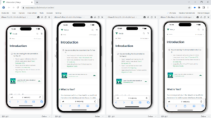
The iPhone 15 Pro Max is fully compatible with the Blisk app, providing you with the capability to develop web applications and test cross-browser compatibility. You can utilize this phone either as a standalone device or concurrently with other devices.
Here are the steps to integrate the iPhone 15 Pro Max into your development environment:
- Download the latest version of the Blisk app.
- Launch the Developer Mode from the Toolbar (refer to the screenshot below).
- Click on Device Manager (as shown in the screenshot below).
- From the list, select iPhone 15 Pro Max.
- Click Launch Devices.
These steps will enable you to seamlessly incorporate the iPhone 15 Pro Max into your development and testing processes using the Blisk app.
Launch iPhone 15 Pro Max from Command prompt or Terminal:
To initiate the iPhone 15 Pro Max within the Blisk app, you can use the Command Prompt (Windows) or Terminal (macOS or Linux) for developing web applications and testing cross-browser compatibility, either as a standalone device or concurrently with other devices.
Here’s a step-by-step guide:
- Download the latest version of the Blisk app.
- Launch the Developer Mode from the Toolbar.
- Click on Menu: Device Set ➜ Share Set.
- Choose Command and click Next.
- Select iPhone 15 Pro Max from the list and click Next.
- Copy the generated command.
- Launch the Command Prompt or Terminal, paste the command, and execute it.
Following these steps will enable you to seamlessly use the iPhone 15 Pro Max in the Blisk app for your web development and cross-browser testing needs.
Summary on iPhone 15 Pro Max:
| Attribute | Details |
| Release Date | Sep 22, 2023 |
| Vendor | Apple |
| Device Type | Phone |
| Operating System | iOS |
| Display | LTPO Super Retina XDR OLED, 110.2 cm2, 19.5:9, ~89.8% screen-to-body ratio |
| Screen Size (Resolution) Width | 1290px |
| Screen Size (Resolution) Height | 2796px |
| Viewport Width | 430px |
| Viewport Height | 932px |
| CSS Pixel Ratio | 3 |
| Display Size | 6.7-inch |
| Pixels Per Inch | 460 PPI |
| Dimensions (mm) | 76.7 mm × 159.9 mm × 8.3 mm |
| Dimensions (inch) | 3.02 inch × 6.3 inch × 0.33 inch |
| Device Weight | 221 g |
Read: